Weather Line
The best weather app for iOS just got even better. Super Forecast lets you combine data from the #1 forecasting, rain, and radar services, adds a radar view and tons more.
Ryan came to me a few months ago with a really good idea of what he wanted Weather Line 2 to be. He had a solid feature set and he already had made some rough mockups of the structure of the app. All he needed was someone to solve a few UX problems and visually bring the app to life. Normally I would just say no to projects like this, but I couldn’t pass up the opportunity to collaborate with Ryan.
Since we worked on the app 100% remotely, working in Figma proved invaluable. It allowed us to quickly brainstorm ideas together or asynchronously.
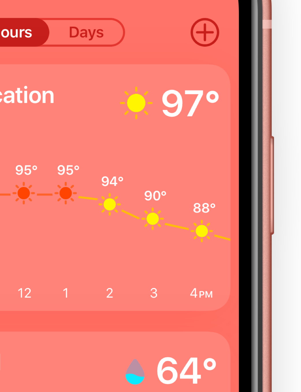
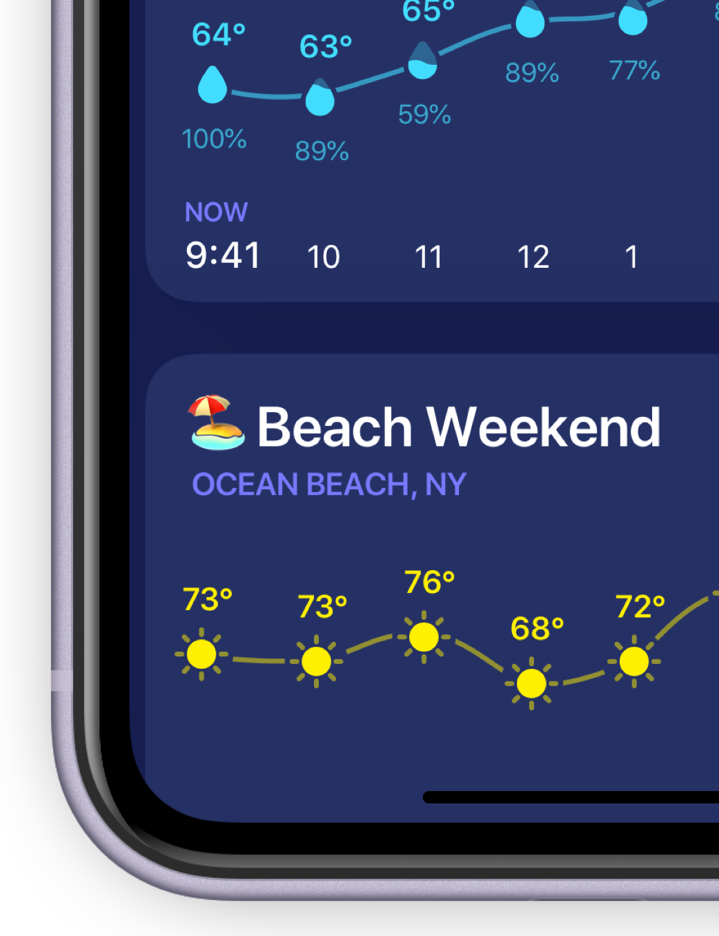
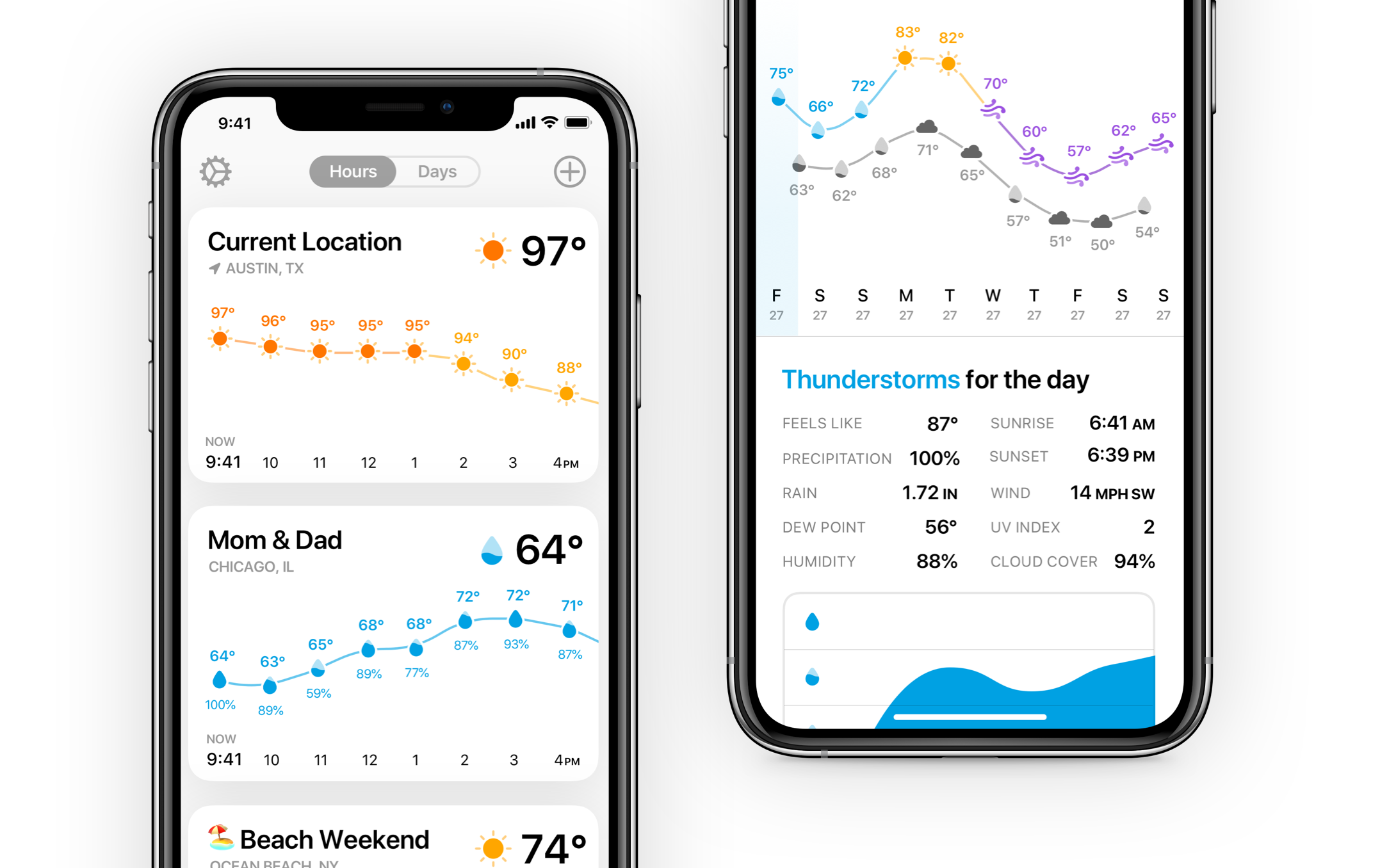
We designed the app from the ground up to be themed. Who said weather apps should be boring? Not us. That’s why we took great care in designing themes that actually make you want to look at the weather.
The biggest challenge with the app was about figuring out how to display lots of different information to the user in a way that still felt lightweight and didn’t require entering in and out of pages. I was a big fan of the first version of Weather Line, so we decided to keep all of the core interactions the same and allowed the details screen to scroll for more information.
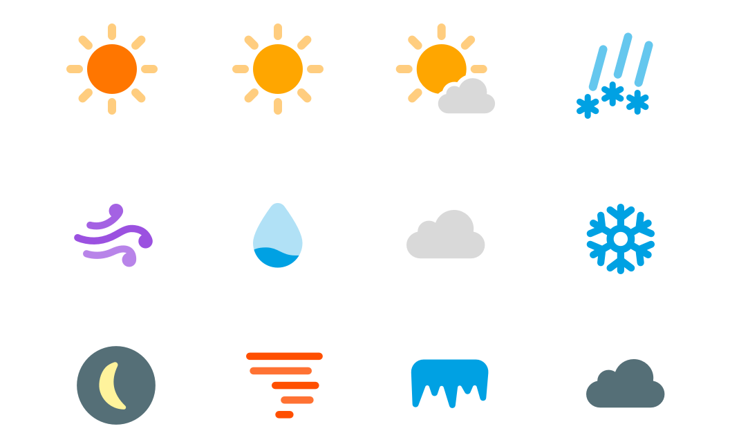
That being said, since icons are such a big part of the app, we used decided it was time to refine the icon set to improve legibility and match iOS 13’s more rounded look.
