Climate
After getting the Apple Watch, I noticed that in my usage the most useful apps were the ones that presented me with information quickly and let me go along with my day. Apps like Calendar, Activity and Weather were the apps that really worked well on the watch. There was one major problem with that: the 1st-party weather app for the Apple Watch leaves a lot to be desired.
I decided that instead of complaining about it on Twitter, I’d do something a bit more productive: I’d make my own app. It seemed like an interesting challenge both from a design and development standpoint.
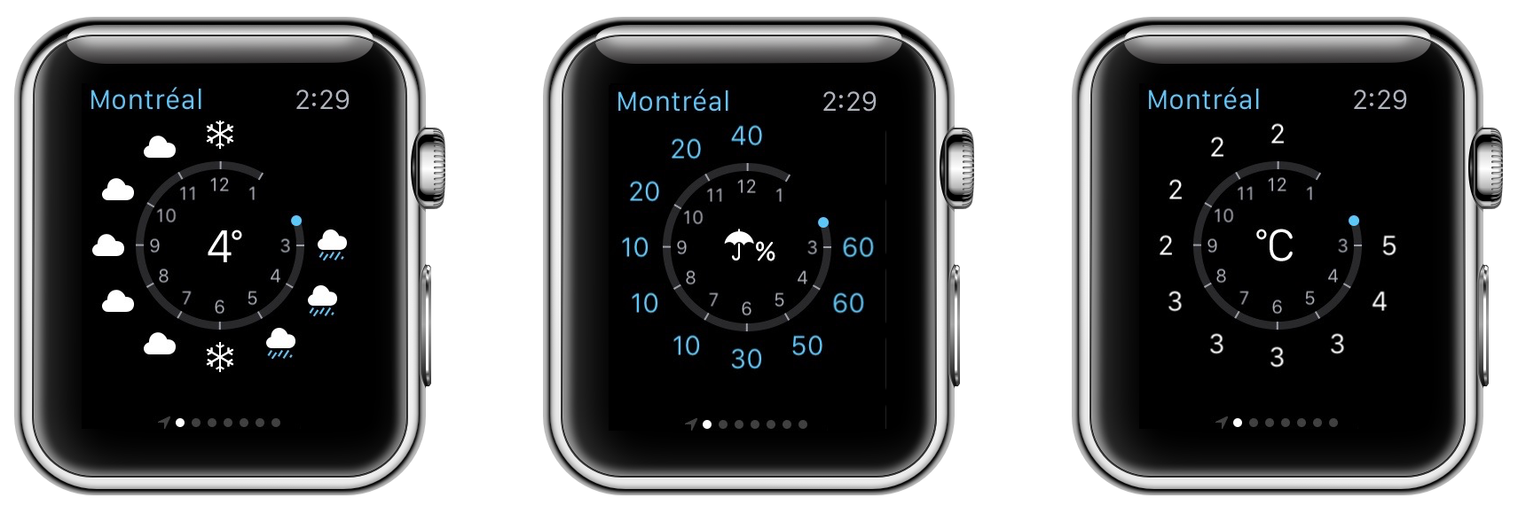
If you own an Apple Watch, you know exactly what I’m talking about in regards to the stock weather app.
Needless to say, this is a very odd design choice. Putting the information around a circle means that there’s very little space to fit the necessary information, so they had to split it up across three views. In a device where the time spent should be counted in fractions, switching between these view takes what seems like an eternity.
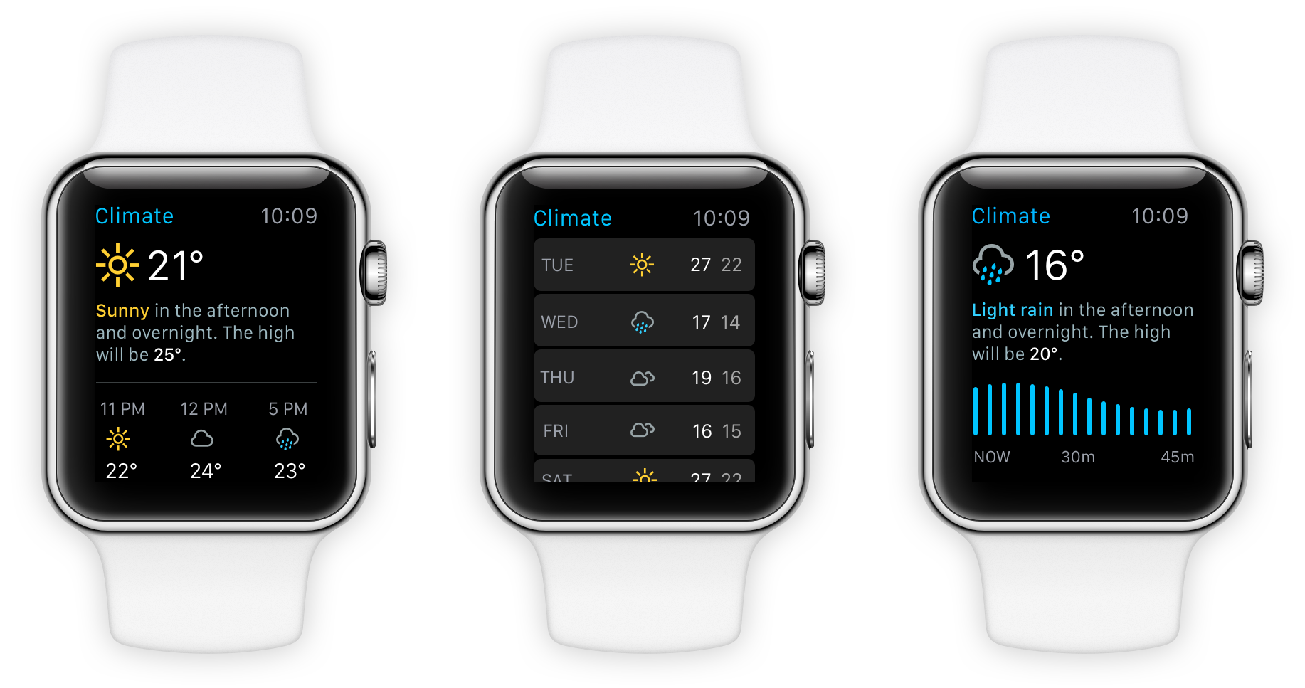
I decided that instead of complaining about it on Twitter, I’d do something a bit more productive: I’d make my own app. What I decided to do with my app was simplify the interaction model and putting things you want to know immediately at the top and what’s happening later at the bottom.
I decided to simplify the interaction model of the app and put things you want to know immediately at the top and what’s happening later at the bottom.
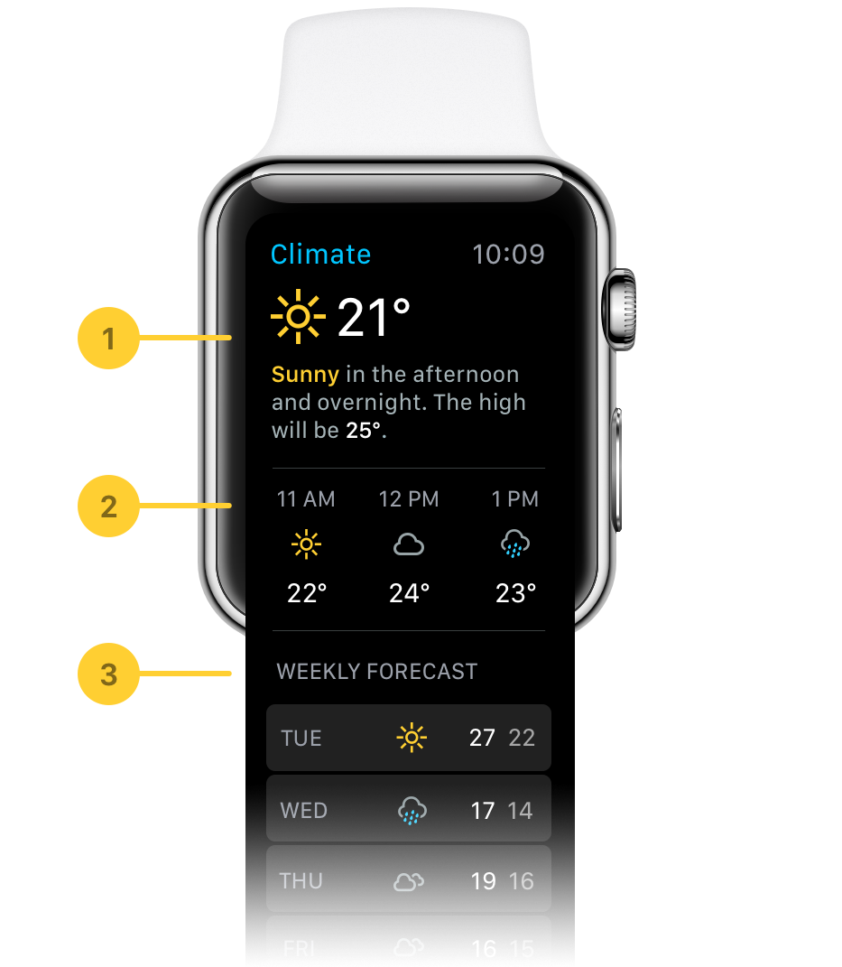
Here’s a breakdown of the sections of the app
- The first section is all about what is happening right now. At a glance, you get the temperature, the condition, as well as a text description of what’s happening. I love being able to read a human-friendly description of the situation.
- The second section is about what is happening in the next few hours. Want to know how warm it’s going to be when you go out for lunch? The app’s got you covered.
- Finally, the third section is about what the forcast is going to be during the week. You can drill down to a specific day to get more information if you want to know more details.
