Tiny Conf

A few months ago, a couple of coworkers decided to organize a conference. At the time, they weren’t really sure how the conference would evolve, but they knew a few things: they wanted an intimate conference that would inspire people instead of focusing on technical challenges.
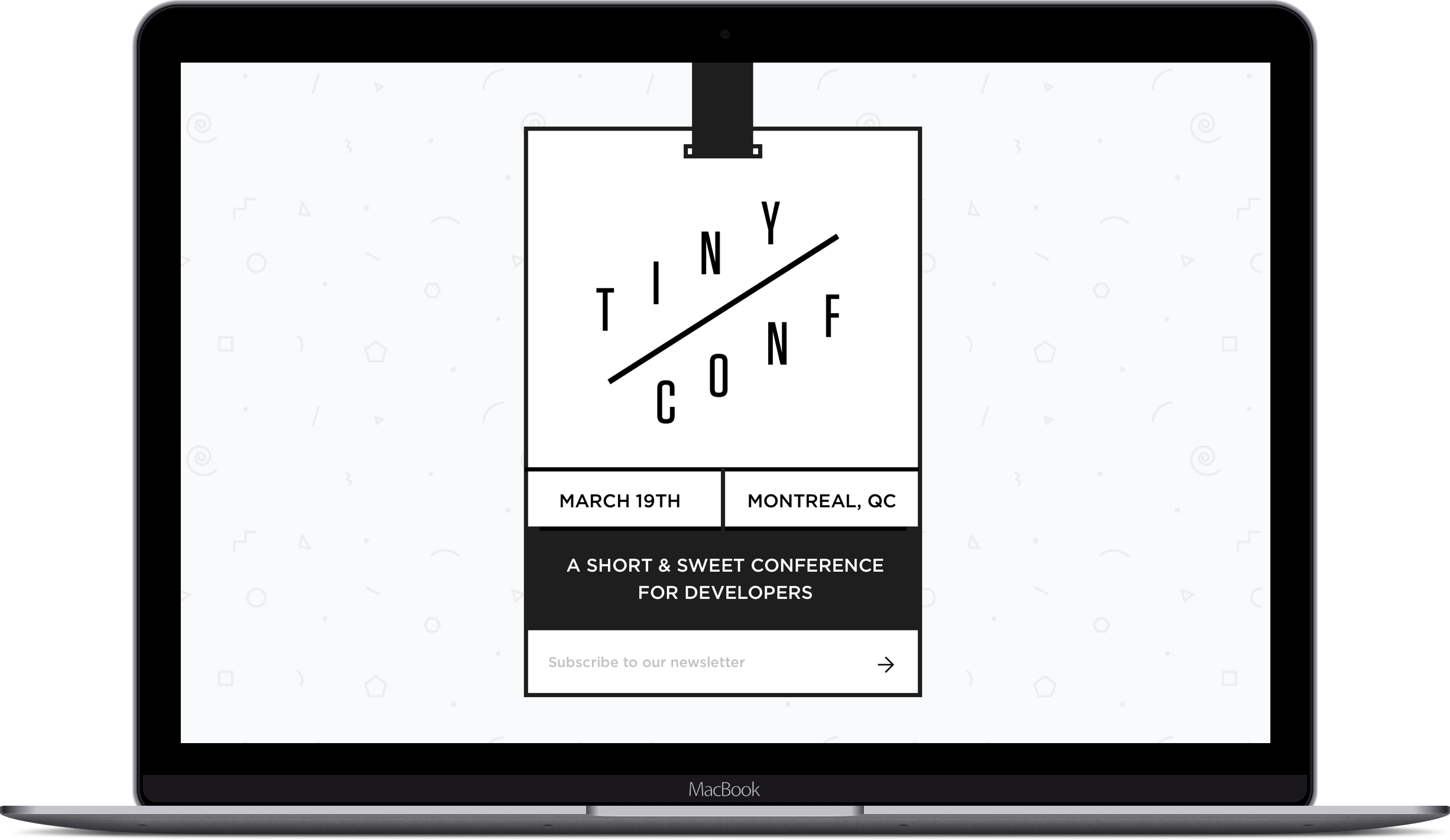
I quickly made this landing page to allow people to sign up before the rest of the details are figured out. I played with a few concepts, but eventually settled on this fake lanyard. It instantly conveyed that this was a conference and allow us to use playful animations to make the page come to life.
One of my favorite little details is when you subscribe to the newsletter, the lanyard flips over to reveal more information. It was my first time playing with perspective and 3D elements in CSS, so I learned a lot.
NoteThe conference never really happened, but we all had some fun thinking of how we would go about organizing the whole thing.

