Shopify Pay Landing Page


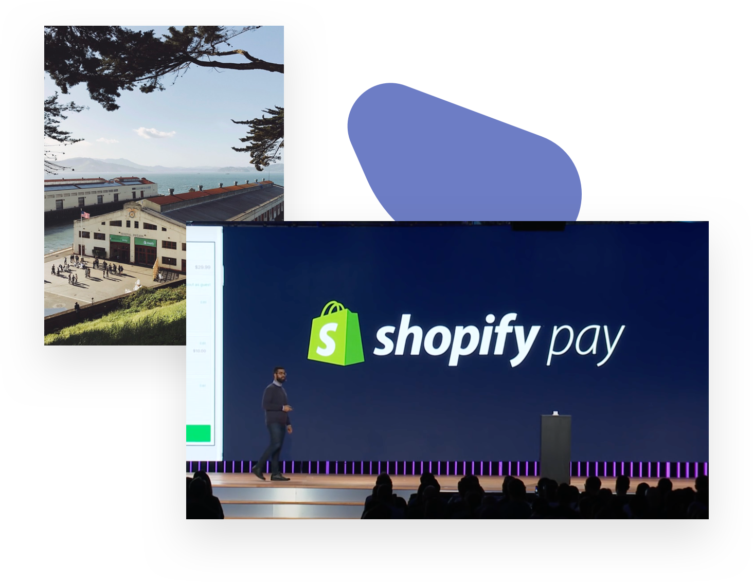
Shopify Pay is the first buyer-facing product Shopify created to simplify and streamline the tedious parts of shopping to let people focus on the parts that they love.
In practice, Shopify Pay allows buyers to opt in to save their information at checkout and be able to automatically reuse it on any other Shopify store. While the core concept is fairly simple to grasp, we thought it would be helpful to provide a page for people to get all of the information on how it works.
Our Goals
- To show people how simple the experience is and set the right expectation for what will happen at their next purchase.
- Reassure people of the trustworthiness of Shopify as the guardian of people’s information. After all for many people, this is the first time they heard of Shopify. It was really important for us to give an explanation of who we are and what we do.
- The last goal was to give people a place to opt-out that was front and center. We didn’t want to bury it or hide it. If you’ve signed up by mistake or change your mind, it should be as easy to opt-out as it was to opt-in.
A big question we had was “should we include the standard Shopify navigation?” While we all liked the consistency of including the same navigation as the rest of the website we ultimately decided to not include it. Why? Because the audience of this website are buyers, not merchants. Including things like our pricing page in the navigation here would’ve added more confusion than clarity. It’s a great example of how consistency is a not a goal in and of itself. In this case, consistency was working against our goal of creating a simple and clear message for our intended audience.
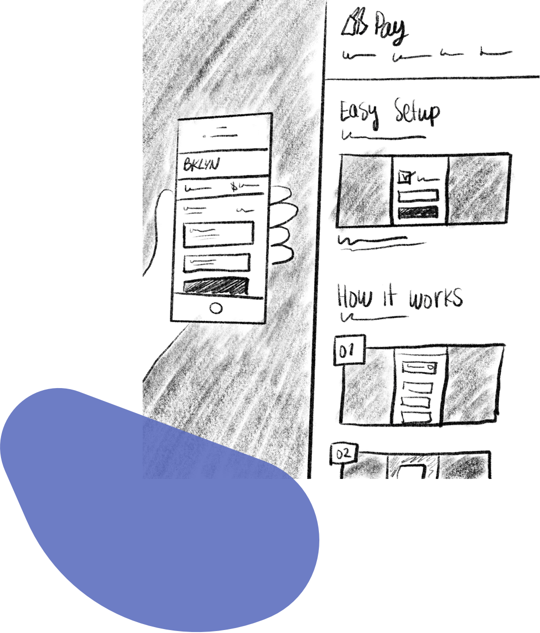
In this case, consistency was working against our goal of creating a simple and clear message for our intended audience.