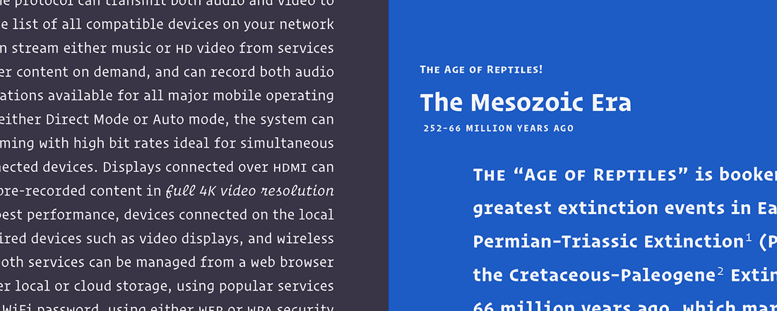
Operator

Hoefler & Co. Just released an interesting typeface called Operator. The most interesting part about it are the italic letterforms. I feel like it would annoy me more than anything in my code editor but I can definitely see it be a great option for a lot of people.
Typesetting is formal, handwriting is informal, and halfway in between is typewriting. Though typewriters haven’t been a fixture of our lives for decades, the look of typewritten letters is still instantly recognizable, making them an indispensable tool for designers. People always choose typewriter faces when they want readers to look past the anonymity of writing, and focus instead on the voice behind the words: the letter from the editor, the solemn report, and the charitable appeal are forever the province of the typewriter font. And because they strike a useful balance between earnestness and down-home charm, they’re perfect for text that risks taking itself too seriously, from corporate communications to cocktail menus.